|
This class, we were learning about developing and designing logos! I decided to design a logo for an animal/ecosystem company! We had to write 15 words to describe our company, and create 15 logos to go with them. Eventually, we would choose our 3 favorite logos to keep. Which three logos did you choose? I chose the three logos circled below. What do these three logos represent? What do the images symbolize? They symbolize a creature possibly a bear/dog who has been saved by this company. In some of the logos, there is leaf that symbolizes peace and trust. Which ones do you like? Which ones do you not like? I liked the first logo I drew a lot- it was cute and simple. However, I didn't like the 4th logo I drew- it was uneven and looks like a pizza :/. How did the process go? I think that the brainstorming process went better than I expected- it went quickly and without much conflict. Was it frustrating? Not really, I was able to come up with ideas if I was stuck. Did you enjoy it? Yes! It was quite interesting to create my own logos and seeing what looked best. Which was the most difficult/easiest? I think that coming up with an idea for my company was the hardest- I didn't know what I was going to make a logo for until I thought of an animal preservation company. 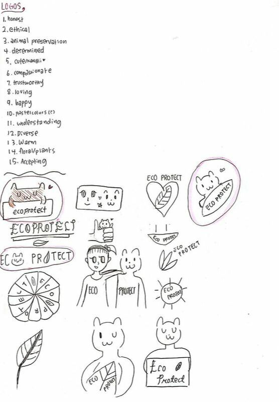
0 Comments
Leave a Reply. |
AuthorHi! My name is Kyra and I like to read! For further information, visit the "About Me" page! CategoriesArchives This work is licensed under a Creative Commons Attribution-NonCommercial-NoDerivatives 4.0 International License. |
