|
Hi! Last lesson, I learned a lot about color schemes. So, we decided to do an assignment where we created the 4 types of color schemes (with 5 colors in each one). Then, we would present them in any way we chose, with the hex codes showing which colors were which. I decided to trace a cat for my color palette- here is the source! Here are the 4 main types of color schemes.
I used a website called Adobe Color to create these color schemes, and I used gravit to create my design. My favorite color scheme was the analogous color scheme- the colors seemed to go together the best, and I liked the way the colors looked individually too. Here is my design! 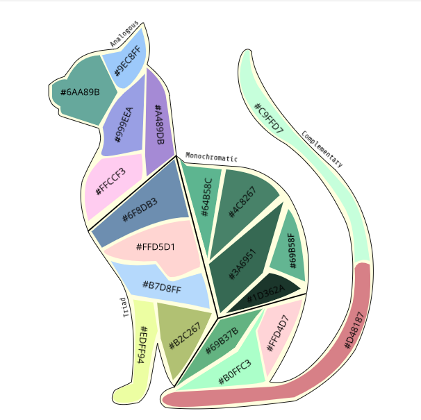
0 Comments
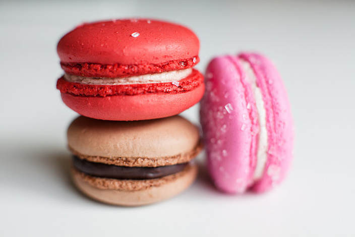
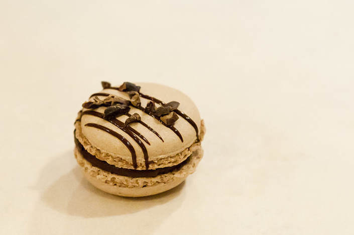
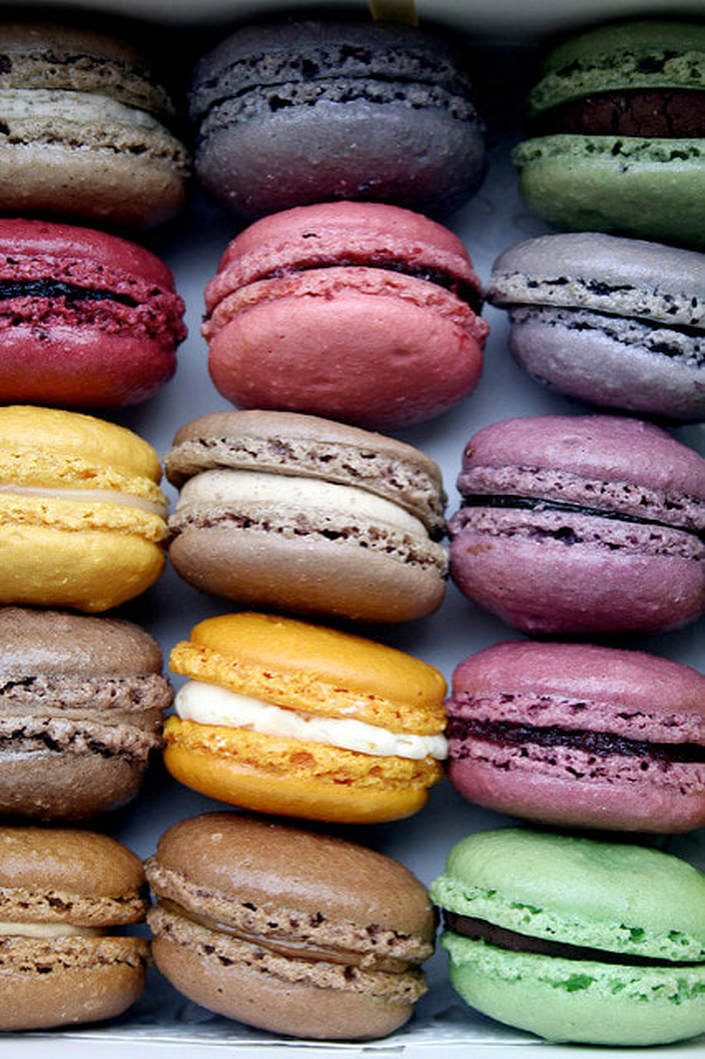
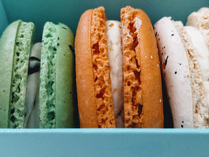
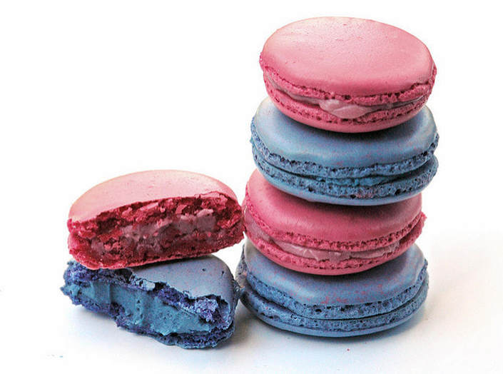
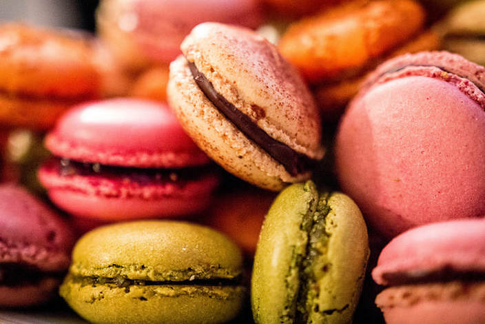
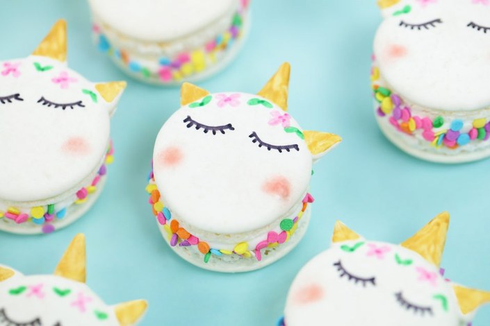
Hi! In today's blog post, I will be writing a bit about typography. In this unit, I learned many new things about typography. First, I learned what typography was & why it's important. Typography is the visual component of the written word. Typography is important because it can change the entire style/feel of a piece that you create. Also, it can attract and hold the audience's attention, and create harmony. In class, we studied a quote-"Each font has a personality and a purpose." This means that all fonts have a way that they are supposed to be used & an unique style, and you shouldn't use fonts in unfitting ways. So, we completed several assignments that focus on this, which I've attached below. In class, we learned about five types of fonts: Serif: These fonts are used in large blocks of text & in print. They have 'feet' , unlike the font I'm using now. Sans Serif: These fonts are great for headlines, titles, and smaller chunks of text. They don't have feet and are very commonly used on the web. Monospaced: These fonts are used for coding, and don't work well for large blocks of text. Each letter takes up the same amount of space. Script/Handwritten: These fonts are cursive, handwritten and calligraphic. They are sometimes difficult to read. Also, they are good for logos, headlines, and details. Novelty: These fonts are good attention getters, and their popularity comes and goes. You should use them sparingly. Typeface comparisonThis was one of the assignments that had to be completed for this unit. In this assignment, we had to write one phrase using the 5 different types of fonts (in gravit) . When completing this assignment, we had to use contrast, repetition, alignment, and proximity. 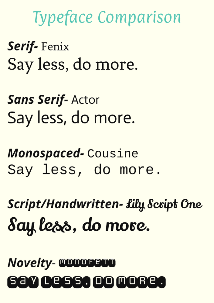 word portraitsThis was the other assignment that had to be completed for this unit. In this assignment, we had to write words that matched and didn't match the font, which emphasized the importance of using fonts correctly (also in gravit) . We also had to use the elements of design when completing this assignment- contrast, repetition, alignment, and proximity. 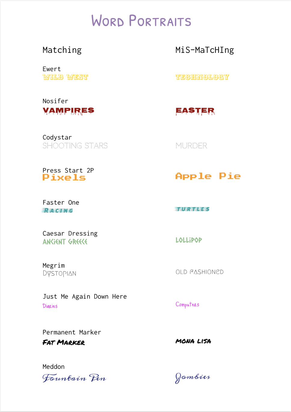 This assignment, we learned how to draw with code. I made the ice creams using the commands ellipse (creating circles) , and used the command triangle to create the cone. To fill the scene with color, I used fill and background- commands that fill the shapes with color. I also used 'text' to label the ice creams. I decided to create ice creams through code because they are one of my favorite treats. Through this activity, I learned how to use basic coding elements and color options. This was very fun, and I have included the image with the code below. 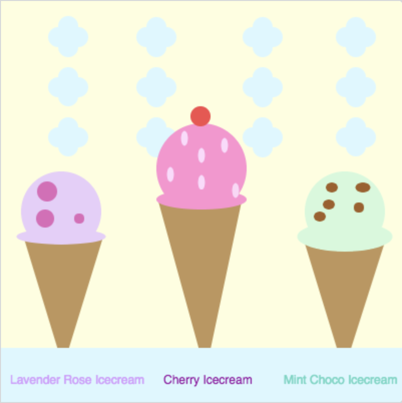 background(253, 255, 222); noStroke(); fill(219, 248, 255); ellipse(145,136,20,20); ellipse(155,146,20,20); ellipse(165,136,20,20); ellipse(155,126,20,20); ellipse(364,136,20,20); ellipse(354,145,20,20); ellipse(344,136,20,20); ellipse(354,126,20,20); ellipse(251,136,20,20); ellipse(261,146,20,20); ellipse(271,136,20,20); ellipse(261,126,20,20); ellipse(57,136,20,20); ellipse(67,126,20,20); ellipse(77,136,20,20); ellipse(67,145,20,20); fill(255, 145, 209); ellipse(200,167,90,90); fill(190, 150, 90); triangle(204,371,157,200,240,200); fill(255, 217, 252); ellipse(169,173,7,15); ellipse(200,181,7,15); ellipse(200,154,7,15); ellipse(223,144,7,15); ellipse(183,137,7,15); fill(255, 145, 209); ellipse(200,198,90,20); fill(255, 214, 247); ellipse(234,189,7,15); fill(233, 205, 250); ellipse(60,210,80,80); fill(190, 150, 90); triangle(62,365,23,237,102,235); fill(233, 205, 250); ellipse(60,235,89,16); fill(210, 250, 219); ellipse(343,210,80,80); fill(161, 95, 37); ellipse(327, 203, 12,10); ellipse(361, 186, 15,10); ellipse(318, 215, 12,10); ellipse(357, 206, 10,10); ellipse(330, 186, 12,10); fill(190, 150, 90); triangle(342,369,384,237,301,235); fill(210, 250, 219); ellipse(343,235,95,30); fill(219, 248, 255); rect(0,346,407,500); ellipse(145,36,20,20); ellipse(155,46,20,20); ellipse(165,36,20,20); ellipse(155,26,20,20); ellipse(364,36,20,20); ellipse(354,46,20,20); ellipse(344,36,20,20); ellipse(354,26,20,20); ellipse(251,36,20,20); ellipse(261,46,20,20); ellipse(271,36,20,20); ellipse(261,26,20,20); ellipse(57,36,20,20); ellipse(67,46,20,20); ellipse(77,36,20,20); ellipse(67,25,20,20); ellipse(145,86,20,20); ellipse(155,96,20,20); ellipse(165,86,20,20); ellipse(155,76,20,20); ellipse(364,86,20,20); ellipse(354,96,20,20); ellipse(344,86,20,20); ellipse(354,76,20,20); ellipse(251,86,20,20); ellipse(261,96,20,20); ellipse(271,86,20,20); ellipse(261,76,20,20); ellipse(57,86,20,20); ellipse(67,76,20,20); ellipse(77,86,20,20); ellipse(67,95,20,20); fill(214, 153, 255); text("Lavender Rose Icecream", 8, 373, 277, 38); fill(155, 10, 163); text("Cherry Icecream", 161, 373, 260, 38); fill(101, 214, 195); text("Mint Choco Icecream", 281, 373, 260, 38); fill(10, 3, 3); fill(224, 103, 186); ellipse(78,217,10,10); ellipse(46,190,20,20); ellipse(44,217,18,18); fill(245, 76, 76); ellipse(199,115,20,20); This class, we were introduced to a project. We would create a complex scene that represented us (using gravit, of course!). This scene shows two owls on a branch, under stars and the moon. This scene is meaningful to me in several ways. The owls symbolize mythology, and the trees & plants in the background represent nature. Both are some interests that I have, and the crescent moon symbolizes how I would like to expand knowledge in both these areas. The misty clouds symbolizes how some of this knowledge is still hard to figure out and very mysterious. 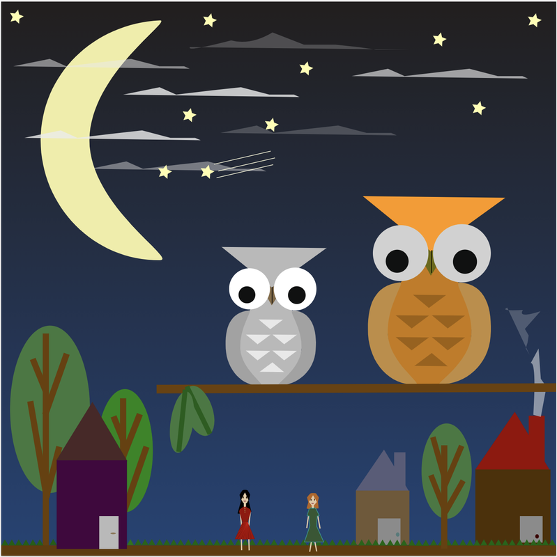 This class, we learned how to combine and modify shapes in gravit. We learned how to use various options. The options that I learned about are union, subtract, intersect, and difference. We can use union to combine two shapes. We can also use subtract to subtract the shapes from each other. Another option we can use is intersect- when we use this, only the parts that intersect remain. Difference removes the part where the shapes intersect. Below are the designs I made! 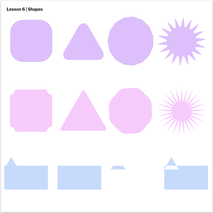 This class, we learned how to control layers using keyboard shortcuts in gravit. We also learned how to group and ungroup several objects on the screen. Last but not least, we also learned how to align things in several ways! I have included some work below! 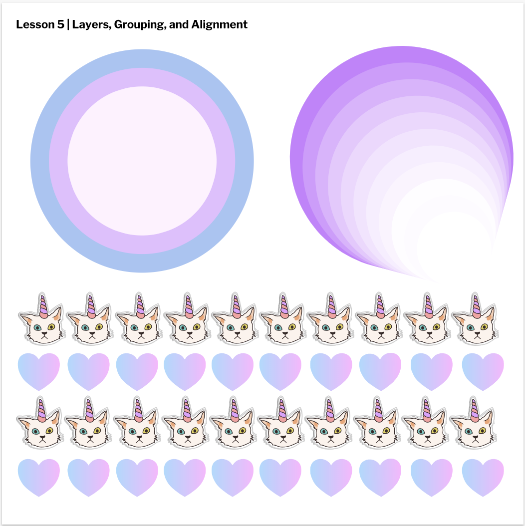 This class, I learned how to use Gravit's tools to improve my graphic designs. I learned how to make shapes and transform their sizes/rotation. I also learned how to use keyboard shortcuts when using tools. Below are the shapes that I created!! 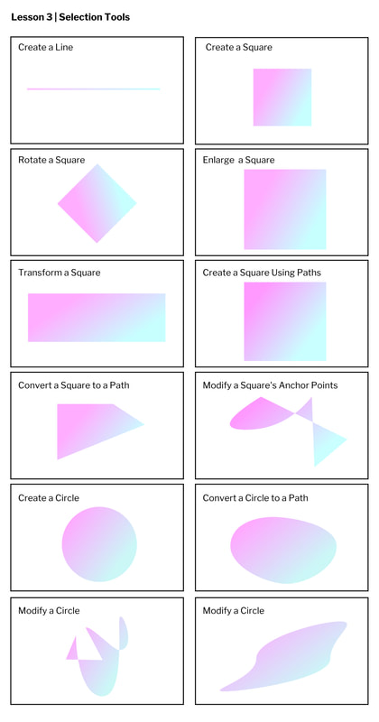 In this post, I will be finding images with various licenses. The theme is macarons ❤️ PUBLIC DOMAINThis is a public domain image. If a work is given this type of license, I can use it in any way. I don't have to give credit to the creator. (Unless a teacher asks me to.) However, I must read the license carefully to be sure I'm allowed to use it freely. 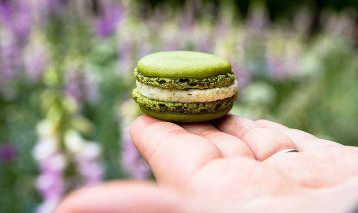
|
AuthorHi! My name is Kyra and I like to read! For further information, visit the "About Me" page! CategoriesArchives This work is licensed under a Creative Commons Attribution-NonCommercial-NoDerivatives 4.0 International License. |