|
This class, I learned how to use a page called Neocities- and I created my own webpage located at https://kyrabooks.neocities.org. I learned more about absolute and relative links, and put both of these in my webpage. Below, I included my code for the webpage and my result! 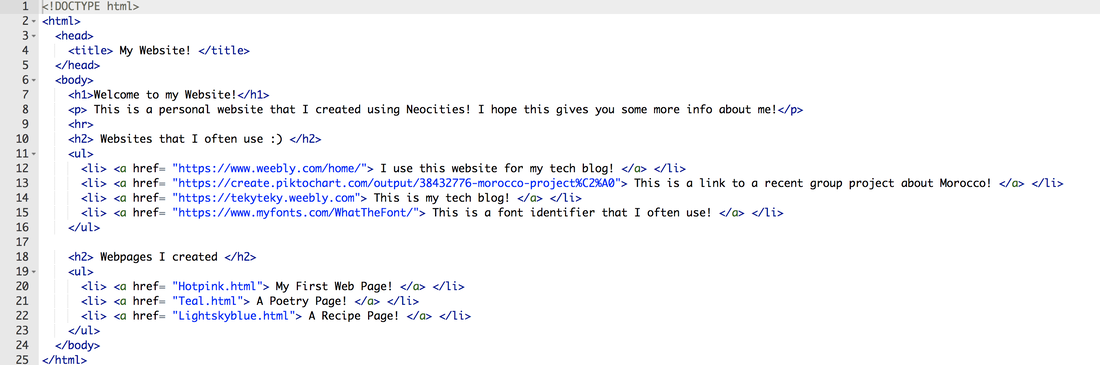 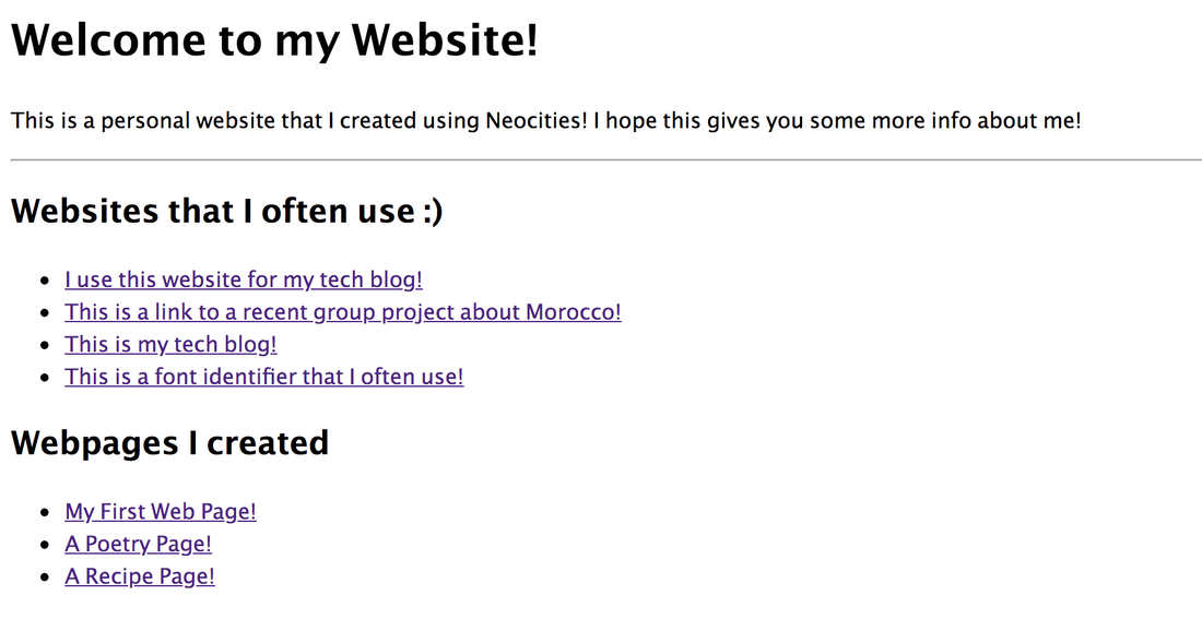
0 Comments
Hello! This lesson, we learned a bit about how to use ordered and unordered tags. We had to create a recipe page, where we would use ordered & unordered list tags. I have included both my code and result below. I decided to use a meringue recipe, and I think it was a cool experience to see how a recipe page could be coded. 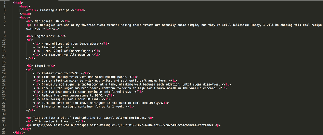 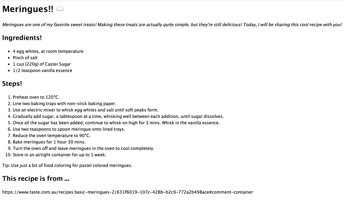 Hello! This lesson, we learned a bit about how to bold, italicise, and create new lines of text without adding paragraphs. We had to create a poetry page, where we would code a haiku, a limerick, and a free verse. I have included both my code and result below. 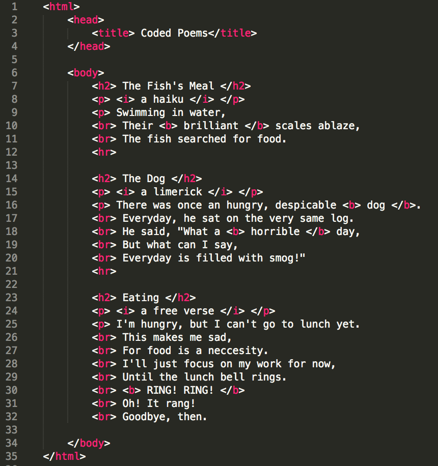 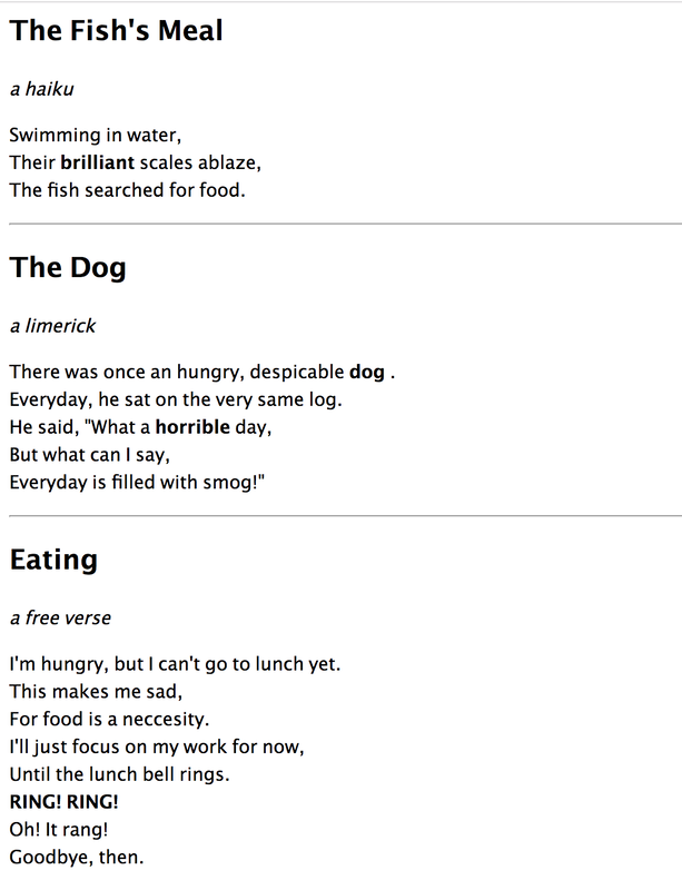 Hello! This lesson, we learned a bit about how to create web pages. It was a great experience, and I decided to create a webpage about some of my favorite Ghibli Movies! I also got to learn about several tags in coding HTML- Head tags, title tags, body tags, and paragraph tags (as shown below). I have included both my code and result below! 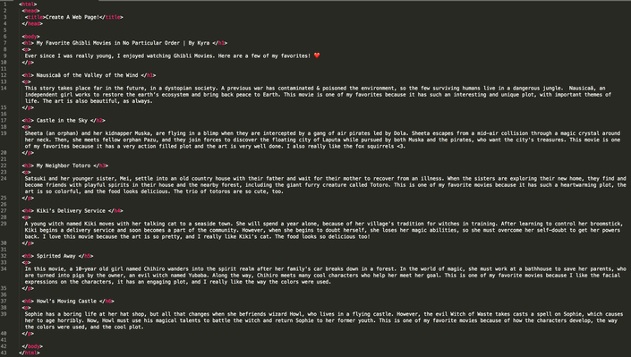 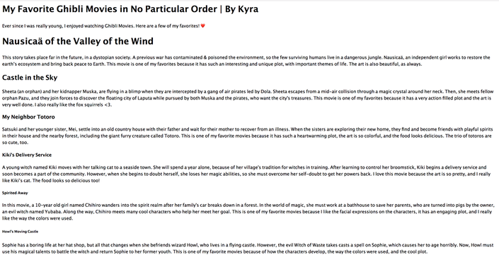 Hello! Today, we were asked to create 3 variations of the three logos that I previously designed, and choose our favorite one. Although I didn't have many things that were frustrating, I think that it was challenging to match the alignment of all the logos, and to make sure that certain elements were arranged above others. My favorite thing about this process was when I got to choose colors for my logos, and when I was coming up with ideas for the variations. Through this process, I learned that designing logos must have meaning behind them. Below are my variations- My favorite logo was the second one I created, from the original version (it's included below). My company is called Eco Protect, and I think that my favorite logo represented the message in a cute and memorable way. It's a company that supports preservation of the environment. Eco Protect is also an animal sanctuary, and travels around the world to help animals in need/being mistreated. We also oppose pollution, and try to prevent companies from using chemicals that will harm the environment. Lately, pollution and animals being endangered have become a bigger problem, so our aim is to preserve wildlife and the environment. This logo was my favorite because it represented the brand and got the key message across- it's a company that preserves the environment, and wants to be loving to animals. I chose this logo because I think that my favorite logo looked the best out of all of my logos- I liked the colors, and I think they supported the theme of the company. Also, even if it's not definite, people will be able to get a vague idea of what my company supports and is about through this logo. The leaf on the poster the creature is holding represents how our company wants to preserve the environment, and the green color scheme shows how we want to maintain a good environment for animals too. 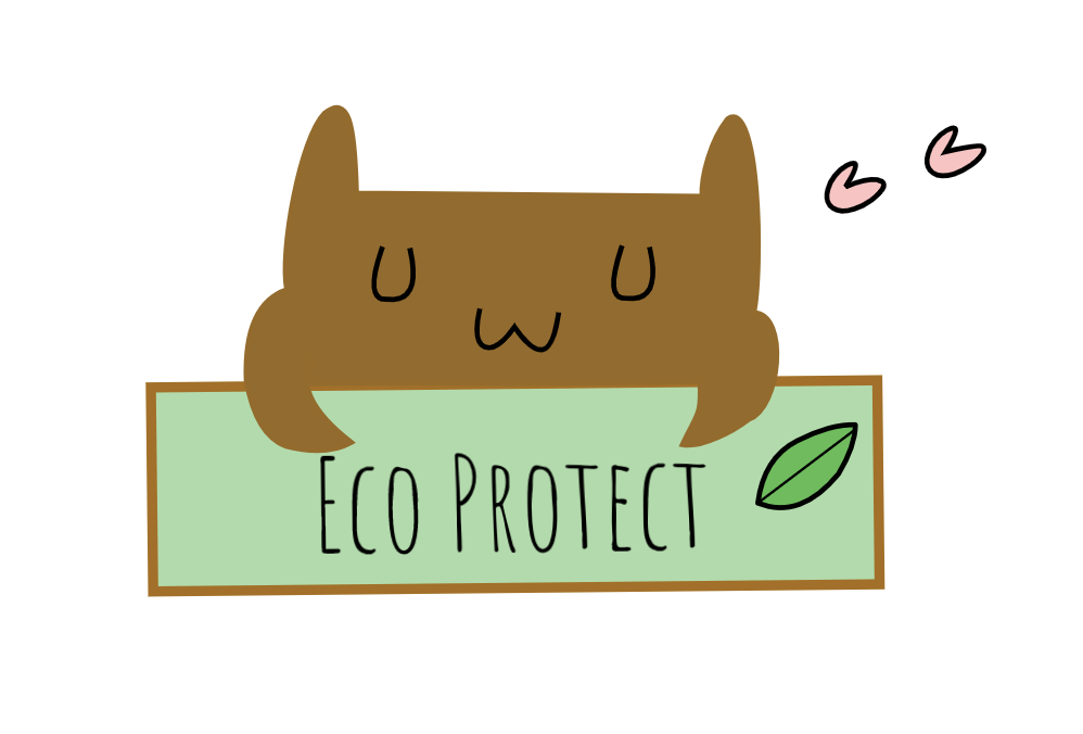 This class, we were learning about developing and designing logos! I decided to design a logo for an animal/ecosystem company! We had to write 15 words to describe our company, and create 15 logos to go with them. Eventually, we would choose our 3 favorite logos to keep. Which three logos did you choose? I chose the three logos circled below. What do these three logos represent? What do the images symbolize? They symbolize a creature possibly a bear/dog who has been saved by this company. In some of the logos, there is leaf that symbolizes peace and trust. Which ones do you like? Which ones do you not like? I liked the first logo I drew a lot- it was cute and simple. However, I didn't like the 4th logo I drew- it was uneven and looks like a pizza :/. How did the process go? I think that the brainstorming process went better than I expected- it went quickly and without much conflict. Was it frustrating? Not really, I was able to come up with ideas if I was stuck. Did you enjoy it? Yes! It was quite interesting to create my own logos and seeing what looked best. Which was the most difficult/easiest? I think that coming up with an idea for my company was the hardest- I didn't know what I was going to make a logo for until I thought of an animal preservation company. 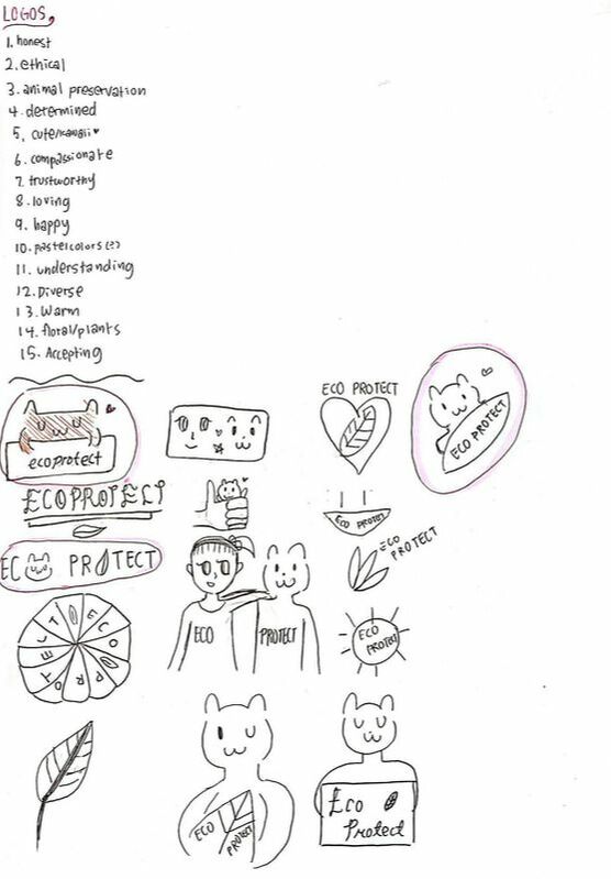 Hi! Last lesson, I learned a lot about color schemes. So, we decided to do an assignment where we created the 4 types of color schemes (with 5 colors in each one). Then, we would present them in any way we chose, with the hex codes showing which colors were which. I decided to trace a cat for my color palette- here is the source! Here are the 4 main types of color schemes.
I used a website called Adobe Color to create these color schemes, and I used gravit to create my design. My favorite color scheme was the analogous color scheme- the colors seemed to go together the best, and I liked the way the colors looked individually too. Here is my design! 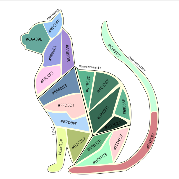 Hi! Today I will be writing about my Color Names Project! I'm learning about hex codes and RGB values in tech class these days. So, our teacher gave us a project to do, called the color names project. As you may know, I am a Studio Ghibli fan and one of my favorite characters are the 3 totoros. So, In this project, I decided to create an icon of the middle totoro and use it for the project. Then, I created 15 different totoros and colored them in 15 different colors. We were supposed to create an icon (in my case, a totoro), and make 15 different colors to color them with. Then, we would find the hex codes and the RGB values for the colors, and use elements of contrast, repetition, alignment and proximity in the process. I made the whole project using gravit.io. Also, I made the totoro using the pen tool, and the rectangle that contained text using the shapes tool. Finally, I created the text using the text tool. Some challenges I faced were finding a good object/icon to create, and choosing the 15 colors. Another challenge I faced was creating even spacing between the columns I created. I overcame these challenges by trying to find inspiration in things around me, and thinking of what colors looked good on the totoro. I overcame the last challenge by creating a rectangle and using it to measure the spacing. Some successes I think I achieved was how I created the totoro- it turned out better than I expected. I also liked how the colors blended together, and the overall design of the project. I was proud of how I used the elements of contrast, repetition, alignment & proximity. I was also proud of how I chose my fonts and colors. I first was inspired to create a totoro after seeing my laptop case, that had a totoro on it. Afterwards, I found an image on the internet that I thought would be good as a reference for the totoro (the one I referenced is at the bottom left corner!) Here is the link! I have included the final project below! 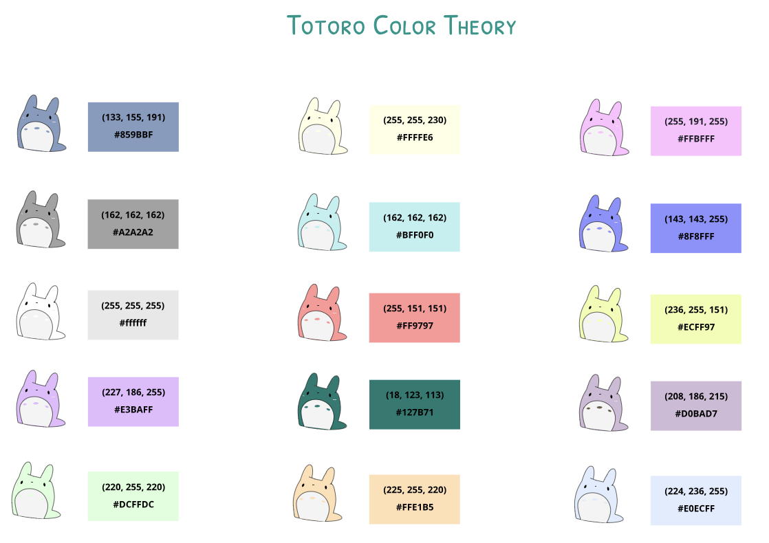 Hi! In today's blog post, I will be writing a bit about typography. In this unit, I learned many new things about typography. First, I learned what typography was & why it's important. Typography is the visual component of the written word. Typography is important because it can change the entire style/feel of a piece that you create. Also, it can attract and hold the audience's attention, and create harmony. In class, we studied a quote-"Each font has a personality and a purpose." This means that all fonts have a way that they are supposed to be used & an unique style, and you shouldn't use fonts in unfitting ways. So, we completed several assignments that focus on this, which I've attached below. In class, we learned about five types of fonts: Serif: These fonts are used in large blocks of text & in print. They have 'feet' , unlike the font I'm using now. Sans Serif: These fonts are great for headlines, titles, and smaller chunks of text. They don't have feet and are very commonly used on the web. Monospaced: These fonts are used for coding, and don't work well for large blocks of text. Each letter takes up the same amount of space. Script/Handwritten: These fonts are cursive, handwritten and calligraphic. They are sometimes difficult to read. Also, they are good for logos, headlines, and details. Novelty: These fonts are good attention getters, and their popularity comes and goes. You should use them sparingly. Typeface comparisonThis was one of the assignments that had to be completed for this unit. In this assignment, we had to write one phrase using the 5 different types of fonts (in gravit) . When completing this assignment, we had to use contrast, repetition, alignment, and proximity. 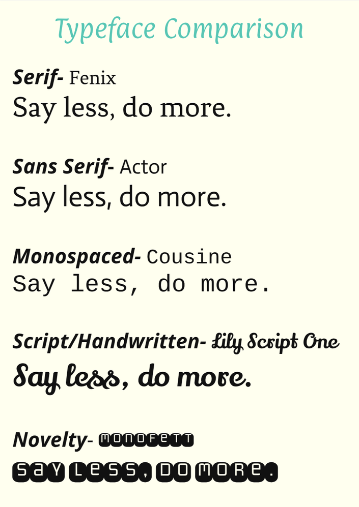 word portraitsThis was the other assignment that had to be completed for this unit. In this assignment, we had to write words that matched and didn't match the font, which emphasized the importance of using fonts correctly (also in gravit) . We also had to use the elements of design when completing this assignment- contrast, repetition, alignment, and proximity. 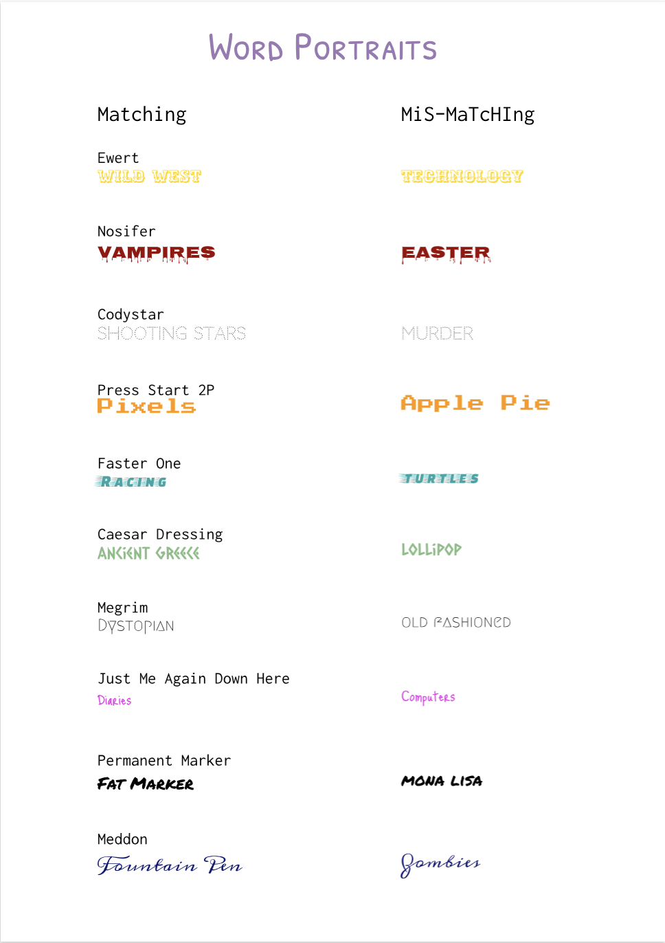 This assignment, we learned how to draw with code. I made the ice creams using the commands ellipse (creating circles) , and used the command triangle to create the cone. To fill the scene with color, I used fill and background- commands that fill the shapes with color. I also used 'text' to label the ice creams. I decided to create ice creams through code because they are one of my favorite treats. Through this activity, I learned how to use basic coding elements and color options. This was very fun, and I have included the image with the code below. 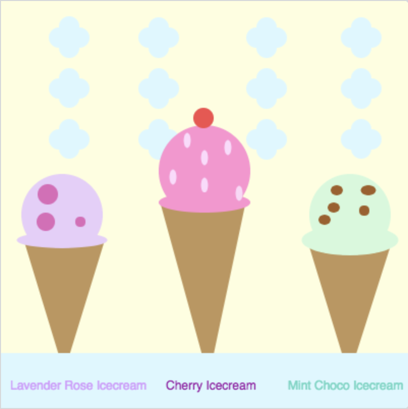 background(253, 255, 222); noStroke(); fill(219, 248, 255); ellipse(145,136,20,20); ellipse(155,146,20,20); ellipse(165,136,20,20); ellipse(155,126,20,20); ellipse(364,136,20,20); ellipse(354,145,20,20); ellipse(344,136,20,20); ellipse(354,126,20,20); ellipse(251,136,20,20); ellipse(261,146,20,20); ellipse(271,136,20,20); ellipse(261,126,20,20); ellipse(57,136,20,20); ellipse(67,126,20,20); ellipse(77,136,20,20); ellipse(67,145,20,20); fill(255, 145, 209); ellipse(200,167,90,90); fill(190, 150, 90); triangle(204,371,157,200,240,200); fill(255, 217, 252); ellipse(169,173,7,15); ellipse(200,181,7,15); ellipse(200,154,7,15); ellipse(223,144,7,15); ellipse(183,137,7,15); fill(255, 145, 209); ellipse(200,198,90,20); fill(255, 214, 247); ellipse(234,189,7,15); fill(233, 205, 250); ellipse(60,210,80,80); fill(190, 150, 90); triangle(62,365,23,237,102,235); fill(233, 205, 250); ellipse(60,235,89,16); fill(210, 250, 219); ellipse(343,210,80,80); fill(161, 95, 37); ellipse(327, 203, 12,10); ellipse(361, 186, 15,10); ellipse(318, 215, 12,10); ellipse(357, 206, 10,10); ellipse(330, 186, 12,10); fill(190, 150, 90); triangle(342,369,384,237,301,235); fill(210, 250, 219); ellipse(343,235,95,30); fill(219, 248, 255); rect(0,346,407,500); ellipse(145,36,20,20); ellipse(155,46,20,20); ellipse(165,36,20,20); ellipse(155,26,20,20); ellipse(364,36,20,20); ellipse(354,46,20,20); ellipse(344,36,20,20); ellipse(354,26,20,20); ellipse(251,36,20,20); ellipse(261,46,20,20); ellipse(271,36,20,20); ellipse(261,26,20,20); ellipse(57,36,20,20); ellipse(67,46,20,20); ellipse(77,36,20,20); ellipse(67,25,20,20); ellipse(145,86,20,20); ellipse(155,96,20,20); ellipse(165,86,20,20); ellipse(155,76,20,20); ellipse(364,86,20,20); ellipse(354,96,20,20); ellipse(344,86,20,20); ellipse(354,76,20,20); ellipse(251,86,20,20); ellipse(261,96,20,20); ellipse(271,86,20,20); ellipse(261,76,20,20); ellipse(57,86,20,20); ellipse(67,76,20,20); ellipse(77,86,20,20); ellipse(67,95,20,20); fill(214, 153, 255); text("Lavender Rose Icecream", 8, 373, 277, 38); fill(155, 10, 163); text("Cherry Icecream", 161, 373, 260, 38); fill(101, 214, 195); text("Mint Choco Icecream", 281, 373, 260, 38); fill(10, 3, 3); fill(224, 103, 186); ellipse(78,217,10,10); ellipse(46,190,20,20); ellipse(44,217,18,18); fill(245, 76, 76); ellipse(199,115,20,20); |
AuthorHi! My name is Kyra and I like to read! For further information, visit the "About Me" page! CategoriesArchives This work is licensed under a Creative Commons Attribution-NonCommercial-NoDerivatives 4.0 International License. |
